
Figure S4.1 shows how global food production, agricultural inputs, and total population have changed over the period 1960–2010, with all variables expressed as multiples of their 1960 values. The figure was constructed for this class and is based on UN Population Division Data and FAOSTAT data (see S1 and S3). Global population is projected to 2050 in the left plot to provide context. This plot shows that global cereal and meat production grew significantly faster than global population, water diversions, and total cropland. The implication is that per capita global food energy and protein derived from cereals and meat have increased, as well as water use efficiency and aggregate cereal yield.
The plot on the right (note the expanded scale) superimposes trends in nitrogen fertilizer and pesticide use, which have grown much faster than cereal production. This result suggests that global nitrogen and pesticide use efficiencies have decreased substantially since 1960. Overall, these results reflect both the success and environmental impact of the twentieth century ‘Green Revolution’, which has made it possible to feed a growing global population through higher yields driven partly by increased inputs and partly by the development of better crop cultivars.
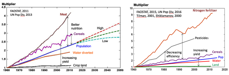
Figure S4.1 Trends in global food production, agricultural inputs, and population
Another picture emerges in Figure S4.2, which compares meat, cereal, and population averages for the globe and for East Africa (note the change in the vertical scale on the right due to much higher population growth in East Africa). East African cereal production has barely kept up with population growth and meat production has lagged behind. Also, it appears that domestic production in East Africa will need to increase much faster in the future if it is to meet the demand of the rapidly increasing population.
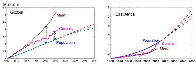
Figure S4.2 Comparison of global and East African trends
Figure S4.3 from FAOSTAT shows the marked differences between conditions in developed and developing countries. These are illustrated in comparisons per capita calorie and protein consumption (total consumption before food losses and waste) from 1960 to 2010. The plots clearly reveal how much higher the USA and EU consumption is than the global average.
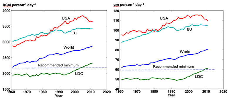
Figure S4.3 Food consumption trends (energy and protein) in different regions (FAOSTAT, 2019)
© FAO. All rights reserved. This content is excluded from our Creative Commons license.
For more information, see https://ocw.mit.edu/help/faq-fair-use/.
Although the global average has been above the UN recommended minimum for some time, the average energy and protein values for the UN’s “least developed country” group have only risen above this threshold since 2000. Figure S4.4 shows that a significant fraction of residents in these countries is still undernourished (FAO, IFAD and WFP, 2014).
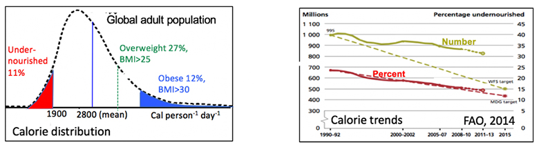
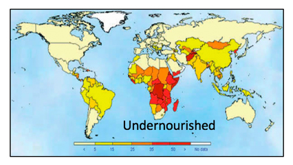
Figure S4.4 Malnutrition trends and distribution (FAO, IFAD and WFP, 2014)
© FAO. All rights reserved. This content is excluded from our Creative Commons license.
For more information, see https://ocw.mit.edu/help/faq-fair-use/.
The chart in the upper left of Figure S4.4 shows an approximate distribution of global energy consumption (in calories), with undernourished, overweight, and obesity percentages indicated. The trend plot in the upper right shows a gradual decline in the absolute numbers and percentage of undernourished people but the number given for 2011 is still above 800 million. The lower chart maps the percentages of undernourished in national populations. It gives estimates of around 30% in much of sub-Saharan Africa. Many of the undernourished in this region are children who suffer long term effects from shortages in critical nutrients.
Figure S4.5a (Gapminder, 2019) shows the strong correlation between calorie intake and per capita income, by country (shown with colored circles). The population of each country is indicated by the area of its circle. Figure S4.5b shows a similar plot of calorie intake vs. the water availability, which is chosen as an example of a natural resource that might limit food production. Note that low income countries with plentiful water can still have low calorie intake while high income countries with scarce water can still have high calorie intake. In short, income seems to be a stronger determinant of access to food than availability of natural resources, because richer countries can afford to import food.
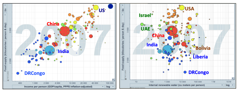
Figure S4.5 Per capita calorie intake for various countries vs. a) income and b) water availability (Gapminder, 2019).
© Google. All rights reserved. This content is excluded from our Creative Commons license.
For more information, see https://ocw.mit.edu/help/faq-fair-use/.
References:
FAO, IFAD and WFP. 2014. The State of Food Insecurity in the World 2014. Strengthening the Enabling Environment for Food Security and Nutrition (PDF - 3MB). Rome, FAO.
Gapminder Tools site. 2019.


